How do you design a landing page that gets you the highest possible conversion rate?
An effective landing page is one of the core elements of reaching your digital marketing goals and increasing conversions on your website. A landing page isn’t just a pretty front; it’s an advanced marketing tool designed to attract visitors and turn them into customers or subscribers.
In this article, we’ll look in detail at how to design a landing page that gets the highest possible conversion rate, using best practices and an effective user experience.
Understand the Purpose of Your Landing Page
Before you start designing a landing page, be clear about its main goal. For example, do you want to collect visitors’ email addresses? Or encourage them to buy a specific product or sign up for a service? Setting the main goal guides the design and makes sure every element on the page serves it.
What Are the Core Elements of a Landing Page?
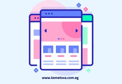
The landing page is the first thing visitors interact with when they arrive on your website, so it plays a big role in turning them into leads or subscribers. To get there, it needs to be carefully designed to focus visitors’ attention on the action you want. Every element should be carefully thought through and aimed at improving the user experience and increasing conversions over time. Here are the core elements of a landing page:
The headline
The headline is the first element to focus on when designing a landing page, and it’s the first thing visitors see when they arrive. It should be attractive and clear. A good headline states the value you offer directly and makes visitors curious to learn more. For example, if you sell a productivity tool, your landing page headline could be: “Boost your productivity by 60% with Tool Z.”
Key tips for improving your landing page headline:
- Use clear, direct language.
- Focus on the main benefit users will get when they sign up.
- Use action words such as “Discover,” “Get” and “Start now.”
The short description
After your headline comes a short description that explains the value you offer in more detail and how visitors can benefit from it. It should be short and direct, but with enough detail to convince visitors to keep exploring the page.
To make your description more compelling, follow these guidelines:
- Use bullet points to show the main benefits of what you offer.
- Write a short but informative description.
- Give specific details that support your headline.
The call to action (CTA)
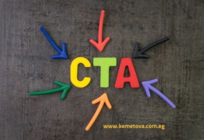
The CTA is the main driver of conversions on a landing page, which makes it the most important element on the page, because it directs visitors to take the action you want. Your CTA should be direct and clear, with persuasive language that encourages visitors to click.
The best strategies for improving your CTA:
- Use attractive colors that make the CTA stand out on the page.
- Avoid generic phrases such as “Click here.” Use phrases such as “Start now” or “Get the offer now” instead.
- Put the CTA in the most visible parts of the page, so it’s always within the visitor’s reach.
See this guide on how to design a call-to-action (CTA) button professionally.
Images and videos
Images and videos play a big role in grabbing visitors’ attention and getting an idea across faster than text. High-quality photos or videos that clearly explain your product or service can make a landing page much more effective.
Use images and videos effectively:
- Use high-quality images that reflect your content and message.
- Avoid purely decorative images; every image should serve a purpose.
- If you have an explainer video for your products or services, make sure it’s short and engaging.
Testimonials and reviews
Adding testimonials and reviews from past customers about your product or service can do a lot to build trust with new visitors. People tend to trust other people’s experiences, so customer testimonials strengthen your offer and increase conversions.
Use testimonials effectively by choosing real, powerful ones, adding the customer’s name and photo where possible, and using testimonials that include specific details about how the customer benefited from your offer.
A strong, compelling offer
Your offer is what attracts visitors and encourages them to take the action you want. Make sure it’s clear and strong, and that it highlights the value users will get. It could be a special discount, a free trial or a gift when they sign up.
Follow these tips for a strong, compelling offer:
- Your offer should match the needs and wants of your target audience.
- Use persuasive language and set a deadline to encourage visitors to decide faster.
- Explain the benefits visitors get as soon as they sign up.
A simple form
The form is one of the most important elements of a landing page, especially if your goal is to collect visitors’ details, such as their email address. The form plays a big role in turning visitors into leads, because it gives them an easy way to respond to your offer and sign up.
To make your form effective, keep it short and direct, asking visitors only for the information you really need. This removes obstacles and makes visitors more likely to complete it, which does a lot to increase your page’s conversion rate.
Read also: the benefits of landing pages and why they matter for your digital project.
How These Elements Improve Your Conversion Rate
- Focus on the call to action (CTA)
As we explained, your CTA should be clear and attractive, with persuasive language that encourages visitors to take the action you want.
- A/B testing
You can’t rely on your first landing page design to get the highest conversion rate. Run A/B tests to try different versions of the page and compare how they perform. Tests can cover changes to the headline, the CTA, the colors or even the order of elements on the page. Try different headlines and images to see what gets you the best results.
- Faster page loading
Fast landing pages improve the user experience and increase conversions. Visitors don’t want to wait long for a page to load, and if it’s slow, they’ll leave without taking any action. Learn about the best ways to improve your website for better speed and performance over the long term.
To make your page load faster, compress images and videos without affecting quality, use tools such as caching, and choose reliable hosting with fast load times. You can sign up for our best high-speed web hosting plans here.
- A better experience on mobile devices
With more people browsing on smartphones, your landing page needs to work fully on every mobile device. It should be responsive and give users a better experience on small screens.
Key tips for a better mobile experience:
- Use a responsive design that adapts to different screens.
- Cut down on text and keep the design simple, so it’s easy to read on smartphones.
- Make sure the CTA is easy to tap on any smartphone.
How to Measure and Improve Your Landing Page’s Success
Once your landing page is designed and live, track its performance regularly with analytics tools. Analyze data such as your conversion rate, to see how many visitors take the action you want, your traffic sources and user behavior. This will help you understand what’s working and what needs to improve.
Key analytics tools you can use:
- Google Analytics, to track visitor behavior.
- Heatmap tools, to see where visitors and users focus their attention on the page.
- Conversion tracking tools, to assess the page’s overall performance.
- A/B tests.
Designing an effective landing page takes a deep understanding of your target audience and the page’s main goals. By focusing on the elements above, and improving the user experience and load speed, you can increase your conversion rate significantly. And don’t forget ongoing analysis and A/B testing to get to the best version of your landing page.
With these strategies in place, you’ll be on your way to the highest possible conversion rates and to reaching your website’s goals. If you have any questions, get in touch, and a member of the Kemetova team will get back to you.